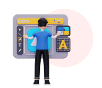
Great User Experience
Make your website easy to use on all devices with a clear and smooth layout.
Most people today use phones and tablets to browse the internet while on the go. This means your website must work well on all screen sizes to attract and keep visitors.
At Way 2 WebSoft, we design websites that adjust automatically to fit any device, whether it’s a mobile phone, tablet, or desktop computer. There’s no need for extra scrolling or zooming. Visitors get a smooth, easy experience every time.
With a responsive design, your website will be easy to read, simple to use, and visually attractive. A user-friendly site keeps people engaged, builds trust, and helps turn visitors into loyal customers.
Request A Consultation
Make your website easy to use on all devices with a clear and smooth layout.
Compatible with desktops, tablets, and smartphones to connect with more people.
A mobile-friendly design helps turn visitors into customers.
Manage one website for all devices—saving time and effort.
Responsive design boosts your site’s rank on search engines like Google.
Our expert team helps you at every step to meet your goals.
At Way 2 WebSoft, we design responsive websites that work smoothly on all devices. We focus on quality, performance, and a great user experience.
After designing your website, we carefully test it using trusted tools to ensure it works fast and without issues.
We add simple and effective buttons or links that guide your visitors, helping to increase engagement and conversions.
Your website will be safe and ready to grow as your business expands.
We follow modern web design standards to make your website user-friendly, clean, and search engine-friendly.
Whether on a phone, tablet, or desktop, we make sure your website looks great and is easy to use.
We avoid messy layouts and extra scrolling, so users can navigate your site comfortably and quickly.


A responsive website helps your business connect with more people, especially mobile users. With so many people browsing on their phones, a mobile-friendly site keeps visitors happy and reduces bounce rates. It also improves your visibility on search engines like Google.
Your customers will find it easier to read, click, and navigate your site. This increases trust and makes them more likely to stay longer or make a purchase, helping your business grow online.


We discuss your goals and plan a layout that fits all screens.

We create a clean, attractive design that reflects your brand.

We test your website on different devices to fix any issues

We go live with a mobile-friendly, SEO-optimised site ready to grow your business.
We have extensive experience in serving different industries and have the resources to meet the need of business small and big alike. You can trust us as a top collateral advertising agency for successfull executionof projects for a wide range of industry verticals

Looking for expert solutions tailored to your business needs? Submit your Request for Proposal today, and our team will provide a detailed response. We offer customised services to meet your project goals efficiently and cost-effectively.
Need assistance? Contact us at info@way2websoft.com or follow us on social media for updates.
A responsive website automatically adjusts to fit any screen size—whether it's a phone, tablet, or computer—so it looks and works great for everyone.
Most people browse on mobile devices. A responsive design ensures your website is user-friendly, boosts engagement, and ranks better on search engines.
If your existing website isn't responsive, we can redesign it to make it mobile-friendly and fully adaptable to all devices.
The time depends on your project size and features, but most responsive websites can be completed in 1–3 weeks.
Yes, search engines like Google prefer mobile-friendly sites, so having a responsive design can help improve your rankings and bring more traffic.